interactive
January 19, 2017
Comparing U.S. presidential inaugural addresses from Washington to Trump
AP
On Inauguration Day, the newly sworn-in president delivers a speech outlining his intentions during his term in office.
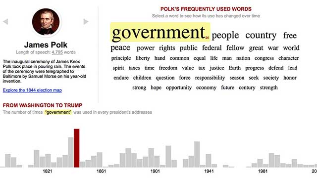
This interactive graphic enables users to explore the history of U.S. presidential inaugural addresses, compare how frequently words such as “power,” “progress” or “peace” are used, and look for trends in the language.
RESPONSIBILITIES
I created a simple Node app that loops through text versions of all of the inaugurral addresses and tallies the most frequently used words. The totals are saved into a .csv file.
I then created two visualizations: a simple word cloud for each address as well as bar graph comparing the totals over time. By selecting a word in the word cloud, the graph is redrawn for the selected word, showing how its use has changed from president to president. By selecting a bar, users can jump to a different presidential address.
Because tabulating the word counts was automated by a script, we were able to include President Trump’s address shortly after it was delivered (and four years later we updated it to include President Biden’s address).